Earlier this year, in more normal times, Anthony Robinson was among a handful of panelists for a symposium titled “Hacking the U.S. Election,” which aired on C-SPAN.
His research on how maps are routinely used to both inform and misinform people—a visually appealing form of real and fake news—caught the attention of many of those in attendance, including Tom Ridge, the inaugural head of the Department of Homeland Security (DHS) and former Pennsylvania governor, who was featured at the event organized by Penn State’s Institute for Computational and Data Sciences and Dickinson Law.
“Afterwards, he came up to talk and was like ‘wow,’ ” said Robinson, associate professor of geography and director of Online Geospatial Education Programs at Penn State. “He started DHS. He worked in emergency management. He approaches my work with a lot of context. And he was surprised to the extent that maps can be used to misinform.”
On maps that go viral, Robinson’s research is two-pronged. He wants to better understand what causes them to go viral to get a handle on who is creating maps that misinform and for what purpose. He also wants to chart elements that promote popular maps to improve their power to inform.
Maps, after all, are designed to inform.
His research lays out a framework for understanding what a viral map is, how we can define it, how we can verify its origin and data, and how we can learn from it. He looks at criteria such as a map’s purpose, audience, content, social engagement, and visual variables, and uses machine learning to automate the process of analyzing the contents and potential origins of viral maps and the maps they have inspired. Many viral maps, he said, spawn a myriad of offshoots that themselves often go viral.
The research began in response to the 2016 election when the FiveThirtyEight map “What if only Women Voted” went viral, spawning more than 500 offshoots, some with seemingly malicious or misinformation purposes. Robinson and his team used machine learning tools such as Google Cloud Vision to analyze these variations and created the site MapReverse.org to visualize these trends.
Tracking the trajectory
Robinson and GeoVISTA postdoctoral researcher Xi Zhu created MapReverse to look at maps shared in social media to uncover their potential sources and derivatives. It combines visualization with machine learning techniques to track when and where maps are published. It can also spot variations in a map.
“Because MapReverse relies on tools still under development and requires advanced computational resources, the project is still in its initial stage,” Zhu said. “We envision that the system can one day provide customized and real-time viral map data that shows where the map originated and its path to going viral.”
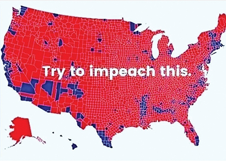
 One example Robinson looked at was the “Try to Impeach This” map that went viral after being shared in 2019 by Lara Trump, the daughter-in-law and campaign adviser of President Donald Trump. Robinson’s tools noted the map first appeared on a blogger’s website but portions of the map were altered in late 2016 in a now removed story by the Huffington Post, according to CNN. The Huffington Post map contained counties won by Hillary Clinton modified to appear in red, indicating a victory for Trump. MapReverse shows that the inaccurate map was the one that went viral.
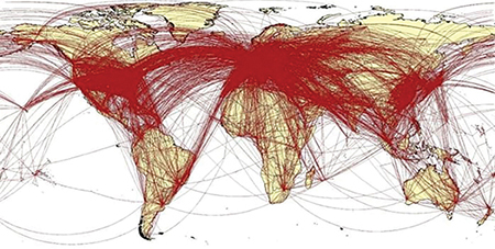
Another viral map, one claiming to portray the flight routes of 60,000 Wuhan residents during the COVID-19 pandemic, originated in a tweet from researchers at the University of Southampton. Further posts clarified that the map was merely an illustration—gleaned from a 2017 map created to show global air traffic patterns—but that didn’t stop major international news outlets such as the United Kingdom’s Sun and Daily Mail from sharing it.
Robinson has also looked at viral maps depicting the Australian wildfires, the radioactive fallout of the Fukushima Daiichi Nuclear Power Plant meltdown, and the probable path of Hurricane Dorian in 2019.
 Dangers of misinformation
People often approach textual information with more scrutiny than they do visualizations such as maps, Robinson said. The lack of civil awareness is concerning, he said.
“Thematic maps are really hard in this context and a lot of what people see in social media are thematic maps,” Robinson said. “There is a simultaneous problem of maps being a powerful way to inform, yet only if it’s done well. People need to consider the source of the data and know that even great mapmakers are making editorial decisions as they boil down complex problems into simplified visual elements.”
Maps can be used for laughs, like the viral and sarcastic Thanksgiving Day Pie by Region map that pits key lime pie in the heart of Texas and pecan pie across the Northeast.
It can also be downright dangerous.
“You can imagine a scenario in which this can cause real harm,” Robinson said. “Let’s say that there needs to be an evacuation due to a wildfire. And officials release the evacuation route. Then someone else enters that situation and makes a credible looking map that shows a different way out. A bad actor could potentially be much faster or more savvy about getting the word out. That’s a pretty scary scenario and a really plausible one.”
On social media sites, disinformation like this is already happening. In September, The New York Times reported that some Oregon residents refused to leave their homes over false rumors that the group Antifa started the fires as a distraction and a way to loot residents’ homes.
The role of social media
Robinson remembers a time where the very act of making a map and publishing it took time, effort and means. But that’s different with easy access to digital tools. However, easily creating maps is nothing without social media, a driver that allows anyone to reach millions of people.
Robinson said social media platforms such as Facebook and Twitter are tuned into this and
are sponsoring research aimed at stamping out misinformation, including via maps. But only to a point. There’s a danger, he said, when companies are able to create massive channels of communication without independent research that can peek behind the curtains.
“My research is something that Facebook might not want to deal with,” Robinson said. “They’ve done pretty well with people knowing little about what they do.”
Facebook offers little data—even anonymized—for researchers to study the patterns of misinformation. Twitter, he said, releases more data and is a major focus of his research. By design, apps like SnapChat, WhatsApp, and TikTok release no information about what is shared for research purposes.
“A really big challenge here is that we’re limited by the channels we can look at, at least on the research level,” Robinson said. On some of these popular social media channels there’s an enormous amount of communication happening that folks outside those companies have almost no access to.”
The future of map research
Robinson’s team has laid out a proof of concept. The next step will be securing the funding and enhancing the technology. In the same fashion that experts are following the trail of fake news to its source, Robinson wants to do the same for maps.
And each election means a steady stream of new
maps to analyze.
Some questions he hopes to answer: Who is sharing these misleading maps? For what purpose are they being altered? How are they evolving?
He also hopes to raise public awareness as he did on C-SPAN. His research hits hardest among the masses of people whose news sources aren’t primarily academic journals.
“Scientists and academics need to figure out what it is that draws people into our research and tell our stories in ways that leverage some of those perceptual and emotional cues used in news and maps that go viral. Because otherwise we’re facing an onslaught of entertainment information,” Robinson said. “And there’s no way to compete with that if you just stay in your lane. If you only write papers, it doesn’t land with the people who need to hear it most.”

